matplotlib grid
Add Grid Lines to a Plot
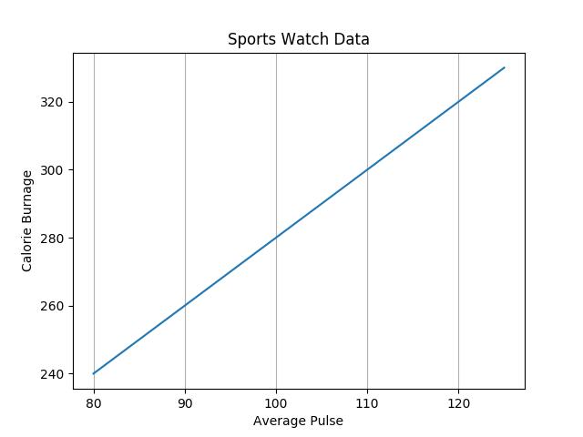
With Pyplot, you can use the grid() function to add grid lines to the plot.
Example
Add grid lines to the plot:
import numpy as npimport matplotlib.pyplot as pltx = np.array([80,
85, 90, 95, 100, 105, 110, 115, 120, 125])y = np.array([240, 250, 260,
270, 280, 290, 300, 310, 320, 330])plt.title("Sports Watch Data")
plt.xlabel("Average Pulse")plt.ylabel("Calorie Burnage")plt.plot(x,
y)plt.grid()plt.show()
Result:
Try it Yourself »
Example
Add grid lines to the plot:
Result:

Specify Which Grid Lines to Display
You can use the axis parameter in
the grid() function to specify which grid lines
to display.
Legal values are: 'x', 'y', and 'both'. Default value is 'both'.
Example
Display only grid lines for the x-axis:
import numpy as npimport matplotlib.pyplot as pltx = np.array([80,
85, 90, 95, 100, 105, 110, 115, 120, 125])y = np.array([240, 250, 260,
270, 280, 290, 300, 310, 320, 330])plt.title("Sports Watch Data")
plt.xlabel("Average Pulse")plt.ylabel("Calorie Burnage")plt.plot(x,
y)plt.grid(axis = 'x')plt.show()
Result:
Try it Yourself »
Example
Display only grid lines for the x-axis:
Result:
Example
Display only grid lines for the y-axis:
import numpy as npimport matplotlib.pyplot as pltx = np.array([80,
85, 90, 95, 100, 105, 110, 115, 120, 125])y = np.array([240, 250, 260,
270, 280, 290, 300, 310, 320, 330])plt.title("Sports Watch Data")
plt.xlabel("Average Pulse")plt.ylabel("Calorie Burnage")plt.plot(x,
y)plt.grid(axis = 'y')plt.show()
Result:
Try it Yourself »
Example
Display only grid lines for the y-axis:
Result:

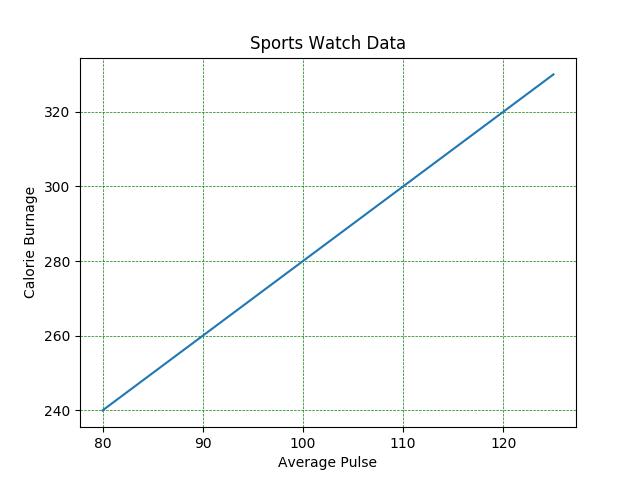
Set Line Properties for the Grid
You can also set the line properties of the grid, like this: grid(color = 'color',
linestyle = 'linestyle', linewidth = number).
Example
Set the line properties of the grid:
import numpy as npimport matplotlib.pyplot as pltx = np.array([80,
85, 90, 95, 100, 105, 110, 115, 120, 125])y = np.array([240, 250, 260,
270, 280, 290, 300, 310, 320, 330])plt.title("Sports Watch Data")plt.xlabel("Average
Pulse")plt.ylabel("Calorie Burnage")plt.plot(x,
y)plt.grid(color = 'green', linestyle = '--', linewidth = 0.5)plt.show()
Result:
Try it Yourself »
Example
Set the line properties of the grid:
Result:
Popular information


Popular articles


Latest articles