Xbox Game Pass is taking a feature from Netflix
Microsoft is preparing to launch a family plan subscription tier for Xbox Game Pass later this year, which will let five players access the service through a single subscription.
The family plan will function much like the premium tiers of Spotify and Netflix , where a central account holder can take out a subscription to the entire Xbox Game Pass library and share it among four other users in different households.
According to Windows Central , which cited “trusted sources familiar with Microsoft's efforts”, the new group tier will cost you significantly less than taking out five individual plans. It will also use Microsoft's existing Family Account system that’s already rolled out for Office 365 .
Specifics about the price of the family plan aren’t yet known. It’s also unclear whether the new tier will encompass Xbox Game Pass Ultimate only, or also be available for the lower-tiered PC and console versions of Game Pass.
Windows Central says it’s heard rumblings of the new plan for quite some time, but the idea has taken a while to get off the ground as Microsoft ironed out details surrounding royalties and compensation for third-party publishers.

The report also says Microsoft will announce the new plan in the “near future”. Remember, until then, nothing has been officially confirmed.
Xbox fans have been calling for a family Game Pass option for some time. Similar models for Spotify and Netflix show that group subscription tiers can save individual users a significant amount of money on their rolling contract bills, splitting the price of the service between several users for a hefty discount.
But family plans are also often favored by service providers for locking in customers. By taking out a group subscription, an individual’s continued use – and payment – of the service is tied to their fellow members. Breaking out of a group subscription, for which your friends and family might be relying on you to keep paying, can be much harder than giving up a solo subscription that rests entirely on your shoulders.
Marshall’s new speaker is its smallest ever and ready to rock all the way to 0.11
If Nigel Tuffnel of Spinal Tap’s Marshall amp goes all the way to 11, then we’re going to have to assume the new Marshall Willen, the company’s latest and smallest-ever Bluetooth speaker , goes all the way up to at least 0.11.
Despite measuring just 101.6 x 100.5 x 40.4 mm and weighing 0.31 kg, Marshall promises that the Willen will deliver the company’s signature “heavy” sound via three presets, boasting one two-inch full range driver and two passive radiators for “solid instrument separation” – something that’s not a given in a speaker this tiny.
IP67 dust-and-water resistant, you’ll get around 15 hours of playback from a single charge of the Bluetooth 5.1 Willen, which can fully recharge in three hours and squeezes three hours of playtime out of a 20 minute charge, if you’re strapped for time.
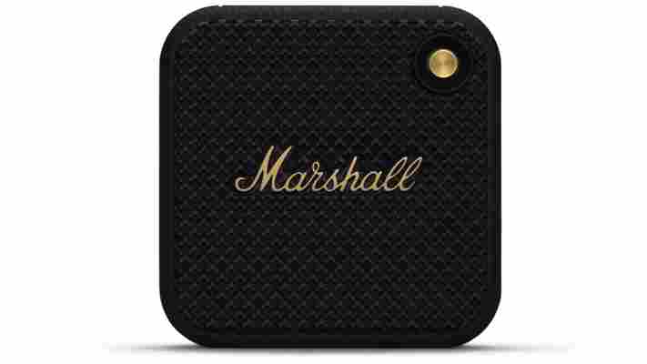
Built-in microphones let you take and reject calls from a connected mobile device, while a “Stack Mode” function allows you to chain together multiple Willen speakers over for multi-speaker audio. Marshall doesn’t mention if the function extends to support alongside its older speakers, however, which are among the best wireless speakers you can buy.
Small stature, big market
The key appeal here though is likely to be the look of the Willen, which apes the larger Marshall speakers of old with a leather-like finish and amp-style grille, as well as physical control knob just like you’d find on guitar amplifiers. It’s a pretty versatile speaker in terms of placement too – not only is it small, it can sit on its side, back or upright, with a rubber-backed strap letting you attach it to other objects too.
That signature look has to do a lot of heavy lifting here too, as the portable speaker market is so competitive. Music fans have loads of options to choose from right across the range of price points, from the top end Sonos Roam to more affordable choices like the JBL Flip 6 and pocket friendly JBL Go 3. Marshall’s bigger speakers have held their ground well in the past, and at first glance the Willen is at least as attractive as its larger counterparts.
It’s priced pretty reasonably too. Launching “this summer” in the US and UK, it’ll cost $119 / £89.99.
Here's why the iPhone 14 needs to keep the notch
One of the oddest, most incredible stories I've read this week has been that Apple might be losing the notch for the iPhone 14.
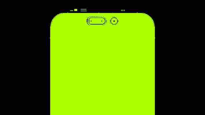
I don't mean the notion that the new iPhone will remove the notch altogether - we've heard that rumor for a few years now, ever since it appeared on the iPhone X in 2017 - but that Apple might go for the 'pill and punch' design instead .
There are just so many reasons why this makes little sense for Apple... not least because it needs a place to house all the sensors and cameras that allow for its Face ID to function.
Don't misunderstand what I'm trying to say though: I desperately want to see the notch, and every little thing that interferes with a smooth screen, to be gone from all smartphones. It's a necessary evil, sure, but I cannot wait for the year when having any kind of notch or hole in the screen of any phone launched is really weird.
But I just can't see it happening in 2022. Perhaps I'll be wrong. Maybe the iPhone 14 and 14 Pro will come with the notch and the iPhone 14 Max will have something different. Maybe Apple will tear up its own design rule book.
But having covered every iPhone launch since the 3G , we've rarely seen anything massively change in this way - the notch, surely, is staying.
A necessary notch
Apple doesn't do anything it doesn't have to. When talking about the very early days of the iPhone, it didn't allow you to copy and paste things between apps. It didn't have a good camera for years.
Only with the iPhone 13 series did it finally offer decent battery life - sure, that likely was a by-product of needing more power to allow for the 5G connectivity, but I was shocked, when I tested the battery life, that Apple hadn't made a huge song and dance about this big increase to battery life in the iPhone 13 launch.
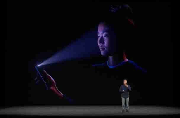
The notch houses a few key things for the iPhone: a variety of sensors, the IR emitter that allows Face ID to function, and the front-facing camera.
These are bigger sensors than you find in most Android phones because Face ID needs them - they have to have a home in the chassis somewhere , so when making the iPhone X this was the best compromise Apple could come up with.
So anything that replaces the notch needs to achieve the same functionality, and I'm not seeing technology on other phones that could do so right now.
The alternative to the notch is ugly
OK, I've instantly lied. I can think of a few things, and one of them is heavily rumored for the new iPhone... but I can't see it happening.
The punch hole and pill-shaped opening have been used in a few phones recently, and do allow for more screen to spill around their edges, giving a bit more screen real estate.
But they still sit there, mildly ruining movie watching or internet browsing, so it's hard to see how they're any better than the notch.
There's also the bigger issue: the implementation of these two differently-shaped holes, by nature, is asymmetrical. I can't see a company that's so obsessed with design ( did you know that the edge of the seats in in the new Apple stores have the same curvature as the iPhone 11 ?) would put something so ugly on there.
I mean, Apple could go for a pop up sensor, but they can fail and also don't allow for the smooth viewing of notifications where you just hover your face over - hugely unlikely given that's a fan-favorite feature.
The 'true' technology isn't ready
Of course, the true 'all display' iPhone is the goal here. Something that doesn't have anything getting in the way of the screen at all, where the sensors are there but hidden somehow.
That could only, realistically, be achieved in one of two ways: either move the earpiece and put the sensors in the frame, or put them under the display.
Sure, we've seen multiple Android phones trying the same thing, and they're getting pretty good - the ZTE Axon 30 , for instance, does a pretty good job of selfie images without a visible front-facing camera.
But 'pretty good' won't wash for Apple, which is hell-bent on talking up its camera prowess at every given point. Having a camera under the screen is also, by nature, covering the sensors slightly, which means that Face ID will likely be slower and / or less accurate.
The only way this will work is when screen tech evolves to let enough light in that Apple's image processing can do its thing, and the IR sensors for security can be miniaturized enough to sit in the frame... but we're not there yet.
The notch is iconic, and people don't really mind it
I'm sat here in a canteen, tapping out some thoughts on the notch and whether it's going to continue... and I can see three people in my immediate vicinity all using recent iPhones that pack the cut-out screen portion at the top.
The truth is that, while the notch isn't the ideal solution, Apple has embraced it and users aren't that bothered. Reports of the iPhone 13 being a record-breaking model - hitting around 40 million sales - suggest that there's not really an issue with the notch in the eyes of those considering which iPhone to buy.
That's not to say that people like it, as it's still something ugly and in the way, but a discussion over on the r/apple forum on Reddit, when discussing if the notch should stay or go , goes some way to explaining the sentiment:
" I have no issues with the notch. My brain ignores it… just like my eyes see my nose at all times, but again, my brain ignores it."
People just don't see it any more. Another thread commenter breaks it down in an even easier way:
"Yes, [Apple] tried to make [the notch] part of the design the best they could. Yes, they’ve exploited this "design anomaly" for their branding, it has a very singular "icon" translation. Yes, it’s not necessary [sic] ugly or aberrant.
"But. It’s not a feature in any way. It’s...a design compromise"
As referenced here, Apple has leaned into the notch. It's taken it from eyesore to emblem.
It's made the notch the icon for the phone, rather than pretending it's not there. People see a smartphone logo with a cutout, and they instantly see an iPhone.
Apple has gone so far with the notion, that it's able to put it in the MacBook Pro last year and it seems to (sort of) makes sense, even though it clearly doesn't when compared to multiple rivals not resorting to the same thing.
So... it seems likely that we'll still see the notch on the iPhone 14. I can't see a way that Apple drops it.
But, then again, I couldn't believe that the brand would have lost the headphone jack in the iPhone 7, even though people wanted it then (and still want) it. I'm sitting opposite someone with the Lightning headphone jack adaptor in, and yet Apple has been unyielding in its shoulder-shrug attitude to the cries to bring it back.
So perhaps I'll be sitting here, writing another piece of analysis in September, talking about how Apple has found a way to stack the pill and punch design in the middle of the screen in an 'elegant' way.
Or that it's completely scrapped the notch and spent a fraction of its massive R&D budget on figuring out how.
Or... maybe the notch will just be 7% smaller, a tiny bit taller and that'll be enough for another year to encourage iPhone sales and upgrades.
And if you don't care, maybe it's time to bite the bullet and go for the iPhone 13. We're still far enough away from the iPhone 14 launch that you'll get a decent deal, and it's too long to wait until August to get the best prices - take a look at the latest prices and see what you think.
Popular information


Popular articles

Latest articles